Healthcare / MedTech / Remote Patient Monitoring
$1.2M
Product Implementation savings
+60%
Delivery Speed
+40%
front-end development efficiency

About Project
Company: Rhythm Management Group
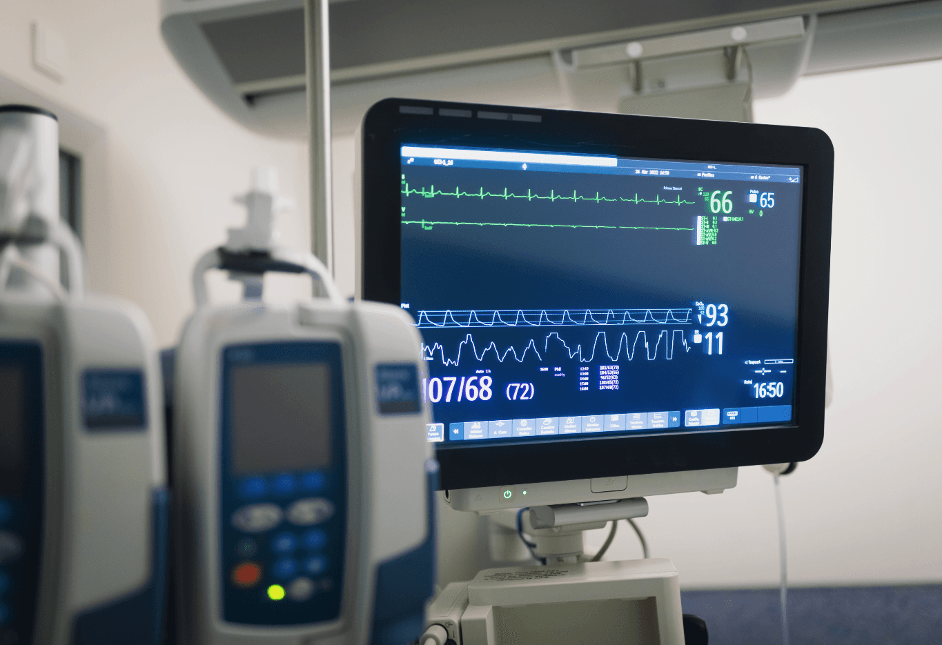
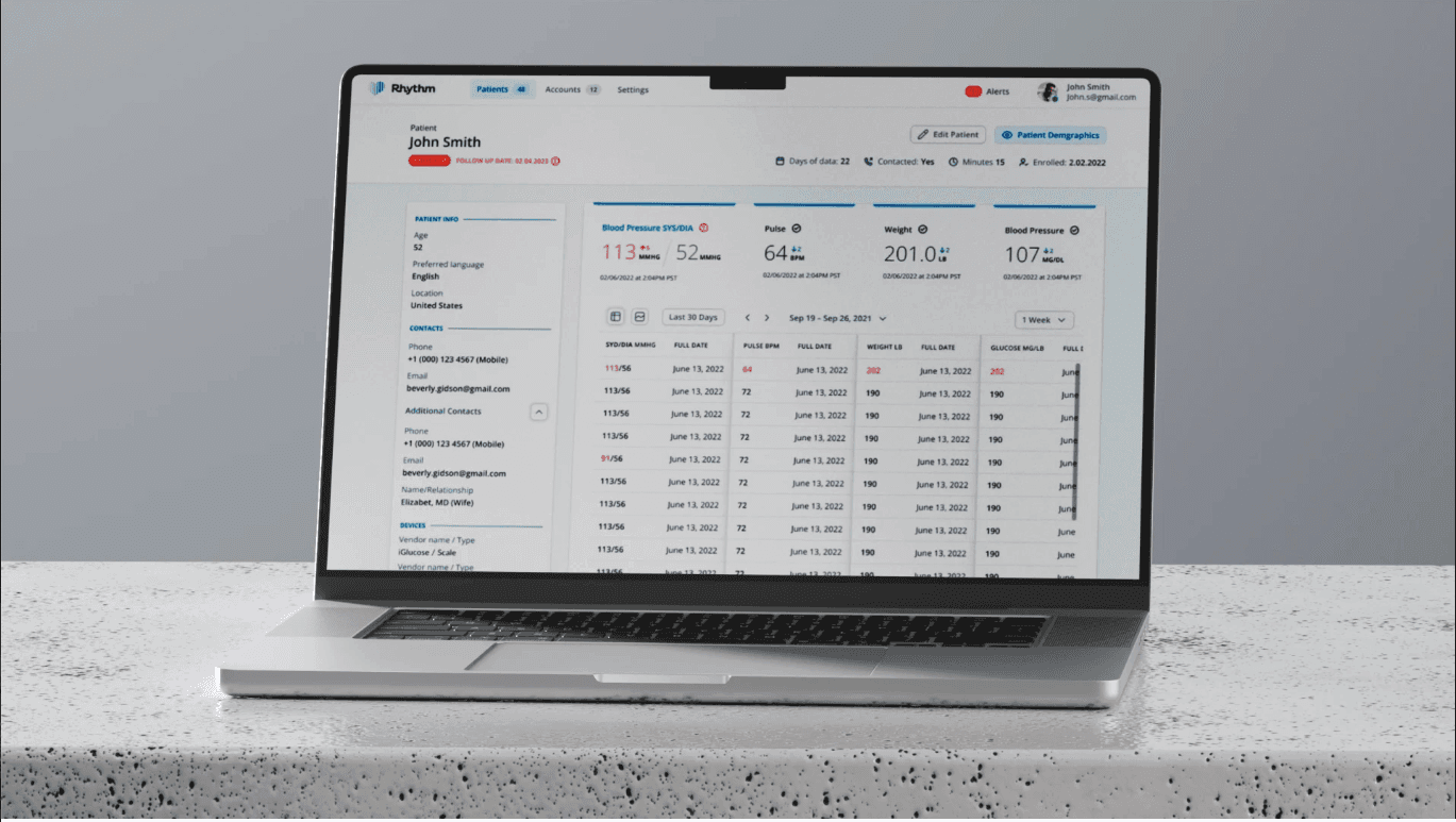
Rhythm Management Group is a remote cardiac monitoring company that supports cardiology and electrophysiology teams by delivering real-time insights from pacemakers, defibrillators, heart-failure monitors, and implantable loop devices. I worked on tools that streamline how physicians and health systems receive and act on patient data, improving speed, clarity, and overall quality of care.

Problem
Fragmented component library causing inconsistent UI and slower development
No responsive framework, making mobile scaling difficult and requiring major UI rework
Low user adoption due to usability issues and inconsistent experience

Phase 1
Phase 2
Phase 3

Phase 5
Phase 6
Phase 7

User Personas


Findings:
Unintuitive user experience
Not optimized for screens under 1400px
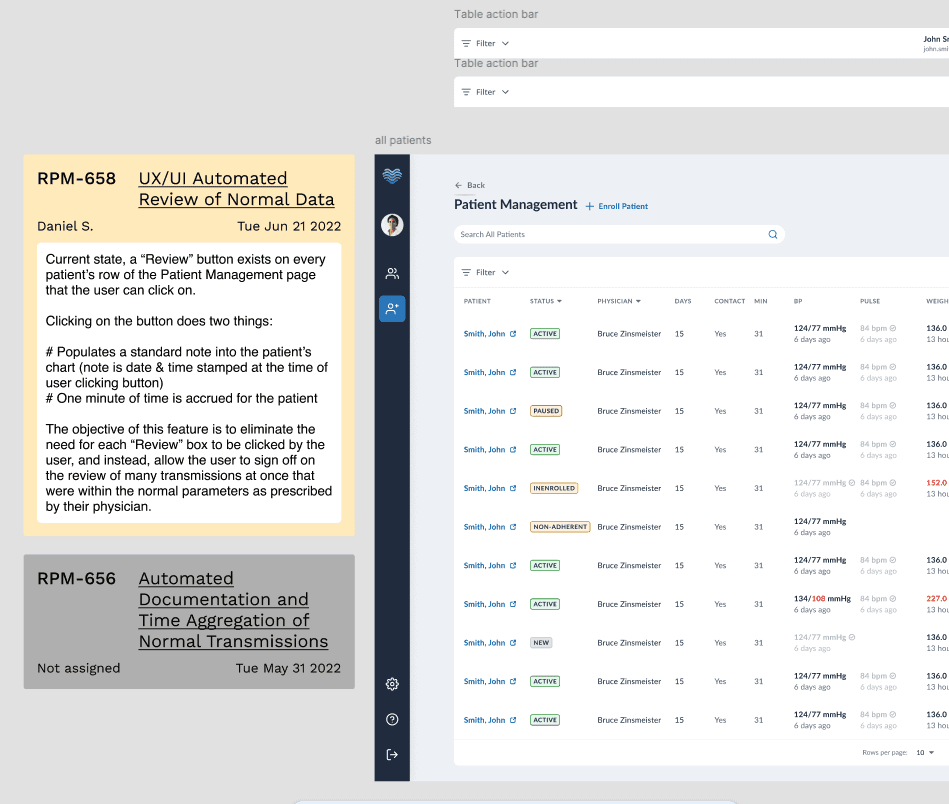
Users spend an average of 73 minutes per day manually reviewing over 200 patients with no disease indicators
Low-fidelity wireframes (New Layout)
The main focus is to create a scalable interface layout and boost feature adoption.
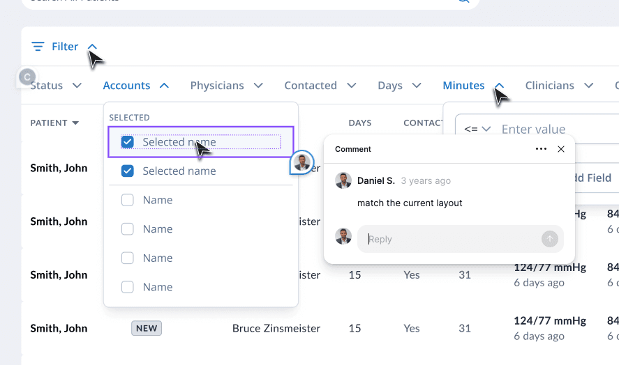
Patient Management Page
Fast Review Mode - foundation for future Ai Integration (Low-fidelity)
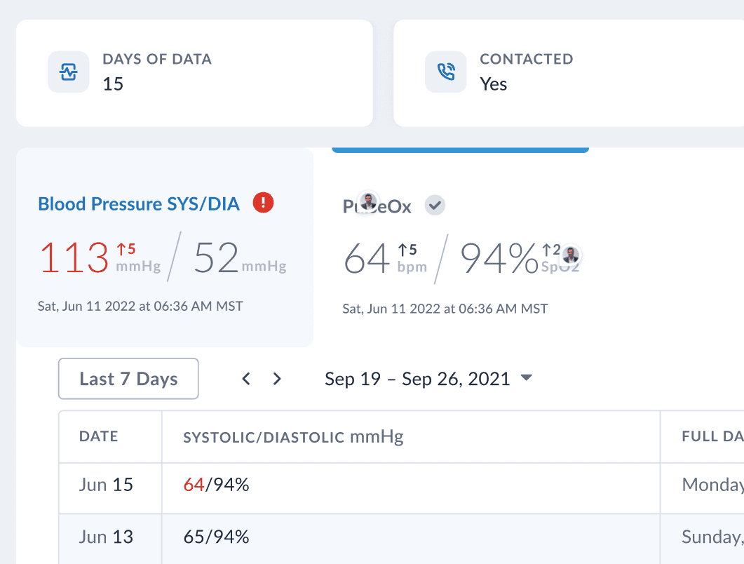
The new fast review mode simplifies the interface by removing unnecessary elements and focusing on data analysis. Users can mark all patients with no disease indicators as “reviewed” by simply scrolling and saving, improving efficiency and enabling quicker decision‑making.


Project results
Reduced development and training costs
Boosted frontend development speed by 60%
Doubled design development speed and improved design consistency
Enhanced brand loyalty
Cut average user time spent reviewing patient data by 70%, from 73 min to 21.9 min per day
Established a strong foundation for future scalability and mobile app development

@DANIELSHUMILOV | ALL RIGHTS RESERVED


